


ABOUT
WEATHERMAP

WEATHERMAP DEFINITION
Any newbie in the Telecom world, when seeing this Weathermap for the 1st time, might have several confusions. Therefore, in the following part, IPTP Networks will explain the definition of this Weathermap, its benefits, details shown in the map, as well as how to read and understand the tool perfectly.
Weathermap is a network map that visualizes network performance and realtime traffic flows of an organization, in this case, IPTP Networks.
The Weathermap tool is not only bringing many benefits to Internet providers, but also widely used by Internet Exchanges, Telecommunication companies, national educational Internet networks (For example, Eduroam in Europe), financial services, government agencies, plus universities and schools.
THE BENEFITS OF THE WEATHERMAP TOOL
As a network performance visualization tool, IPTP Networks’ Weathermap is constantly updated every 5 minutes to make sure users can always get the latest news about the status of our system and the traffic of routes in real time.
Moreover, by checking the Weathermap tool when a problem occurs, you are able to quickly detect which connection is being used by a lot of people, causing the “traffic jam” situation at that time. Thanks to it, you can switch to another route that is “less crowded” and solve the matter on time.
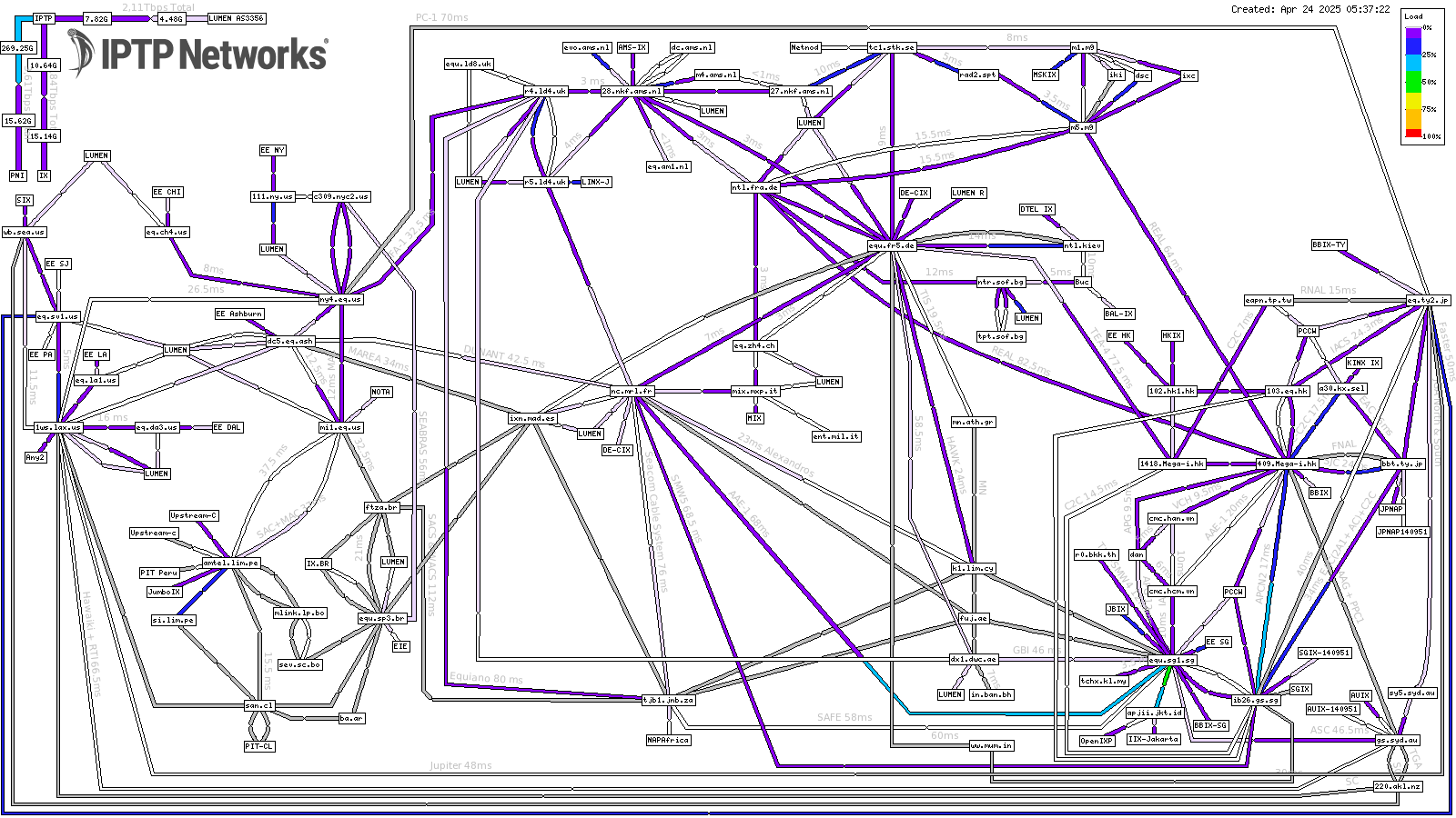
INSIDE THE WEATHERMAP TOOL
In order to be better familiar with this tool, let’s take a deeper dig into elements inside it. Overall, the IPTP Networks’ Weathermap network map has the appearance like this:
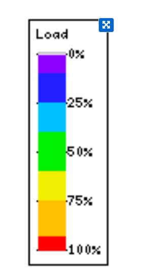

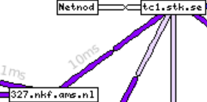
HOW TO READ AND UNDERSTAND THE WEATHERMAP TOOL
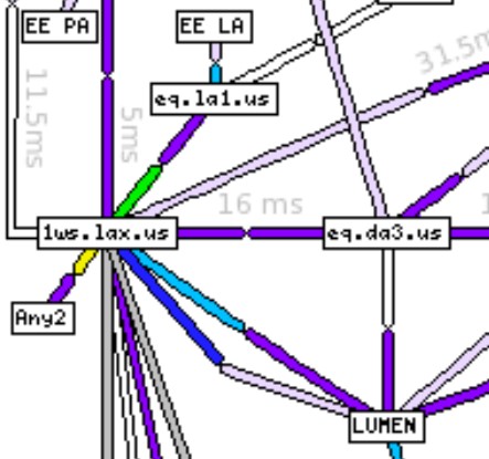
So, basically, you will always see the network connections illustrated as below when opening the Weathermap tool:
Contact
If you experience a problem with this site that you would like to report, please contact us at csiptp.net or use the “Live Assistant” button on the bottom right of the webpage.